Unexpected Pairings That Redefine Home Decor Trends
In 2025, color trends are about breaking the rules and embracing the unexpected. These surprising combinations may sound unconventional, but when used thoughtfully, they create stunning, harmonious spaces. Let’s explore 10 bold color pairings, why they work, and how you can incorporate them into your home.
Some blog articles may contain affiliate links to products or services for which we may receive a commission on transactions. Some of the content on this blog site may be assisted by A.I. generators.
Thank you for visiting our blog!
1. Blue and Orange
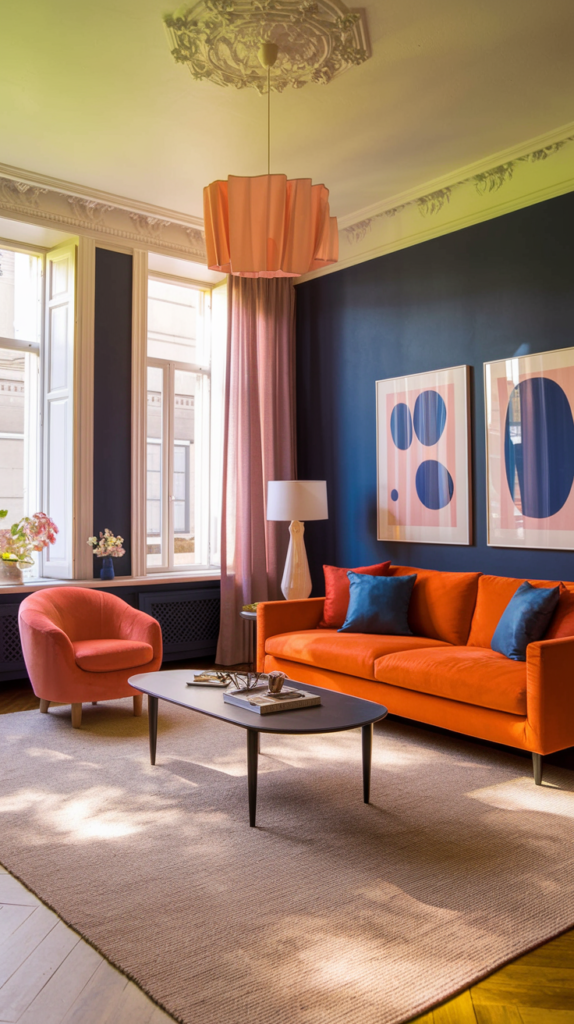
Why They Shouldn’t Work: Blue and orange are complementary opposites on the color wheel, meaning they could clash if overused. However, their high contrast creates a dynamic balance of energy and calm.
Orange stimulates enthusiasm, while blue promotes focus, making this pair perfect for creative spaces.
Inspiration: This duo is bold yet versatile, ideal for creating vibrant, eye-catching decor.
Picture This: Imagine a modern living room with deep blue walls and a vibrant orange sofa. A neutral area rug softens the palette, while blue-and-orange abstract artwork ties the design together. Large windows bring in natural light to keep the look fresh.
Create the Look:
- Paint an accent wall in rich cobalt blue, leaving the others neutral.
- Add tangerine throw pillows and a patterned blue rug for pops of color.
- Incorporate orange and blue vases on a white console table for subtle harmony.
2. Mustard Yellow and Navy Blue
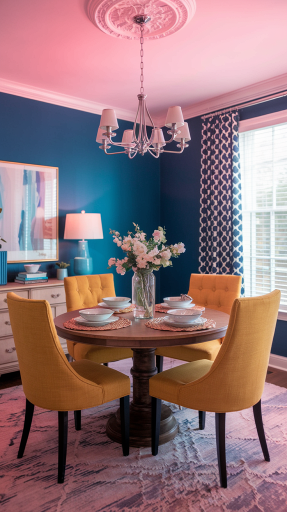
Why They Shouldn’t Work: Mustard’s vibrancy can overpower, and navy’s depth might feel heavy. Together, they create a classic-meets-modern elegance.
Use mustard sparingly as an accent to balance navy’s boldness
Inspiration: This combination adds warmth and sophistication to any space.
Picture This: A dining room with navy-blue walls and mustard-yellow upholstered dining chairs. A round wooden table sits in the center, accented by a mustard-yellow centerpiece and navy-and-white patterned placemats. The look is timeless yet vibrant.
Create the Look:
- Pair navy cabinetry with mustard-yellow handles or hardware.
- Layer a navy sofa with mustard throw pillows and blankets.
- Add navy curtains to mustard-painted walls for a striking contrast.
3. Lavender and Chocolate Brown
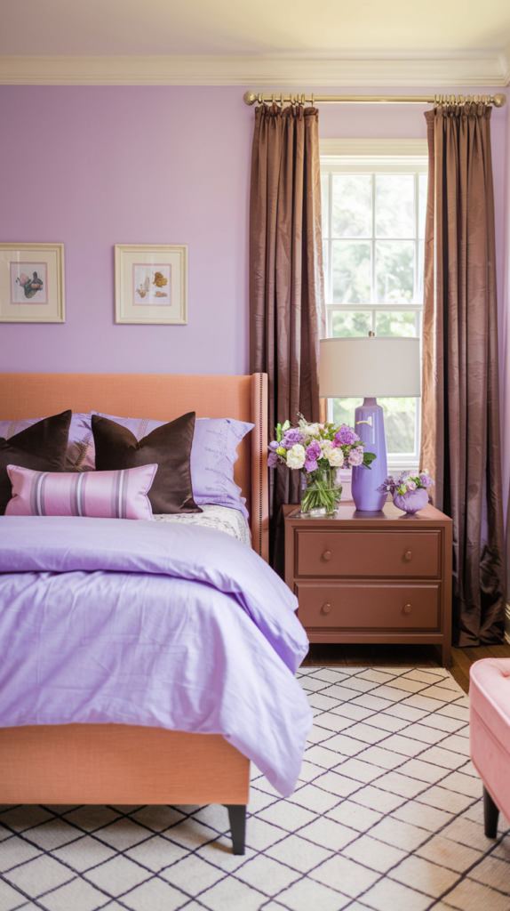
Why They Shouldn’t Work: Lavender’s cool, soft tone might feel out of place next to warm, rich chocolate brown. But their contrast creates a serene and inviting balance.
Lavender is known for its calming properties, making it a great choice for restful spaces like bedrooms or meditation areas
Inspiration: This combo brings elegance and coziness into a room.
Picture This: A bedroom with chocolate-brown furniture and lavender walls. The bed features lavender bedding with chocolate throw pillows, while brown drapes frame the windows. A lavender vase with fresh flowers sits on a brown nightstand, tying the space together.
Create the Look:
- Use chocolate-brown furniture against lavender walls for a balanced aesthetic.
- Incorporate lavender throws and cushions on a brown sofa.
- Choose a chocolate-toned area rug with lavender accents for subtle coordination.
4. Teal and Rust
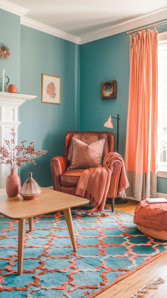
Why They Shouldn’t Work: Teal’s coolness and rust’s warmth might seem mismatched, but together they create a visually striking, balanced palette.
Use rust sparingly as a warm accent to let teal’s richness shine
Inspiration: This duo exudes coziness with a modern twist.
Picture This: A cozy den with teal-painted walls and a rust-colored leather armchair. A teak coffee table sits on a teal-and-rust patterned rug, and a throw blanket in rust tones drapes over the chair. Small teal and rust accents, like vases and cushions, complete the space.
Create the Look:
- Combine teal sofas with rust-colored throw pillows.
- Add teal curtains to rust-painted accent walls.
- Use teal and rust ceramics on neutral bookshelves for subtle touches.
5. Pink and Green
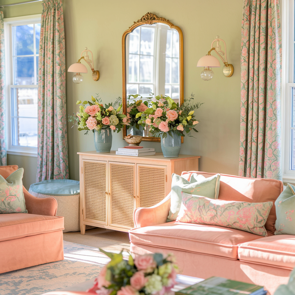
Why They Shouldn’t Work: This combination often recalls floral motifs, which can feel outdated. However, the right tones—like sage and blush—create a sophisticated, modern look.
Green symbolizes renewal and pink romance, making this a great duo for nurturing spaces like living rooms or bedrooms
Inspiration: This pairing blends vibrancy with elegance.
Picture This: A sunlit living room with sage green walls and a blush pink sofa. A gold-framed mirror hangs above a wooden console table with pink and green floral arrangements. The look is fresh, inviting, and serene.
Create the Look:
- Pair sage green walls with blush pink furniture for soft contrast.
- Use pink-and-green patterned cushions on a neutral sofa.
- Add potted plants with pink flowers for natural color harmony.
6. Forest Green and Peach
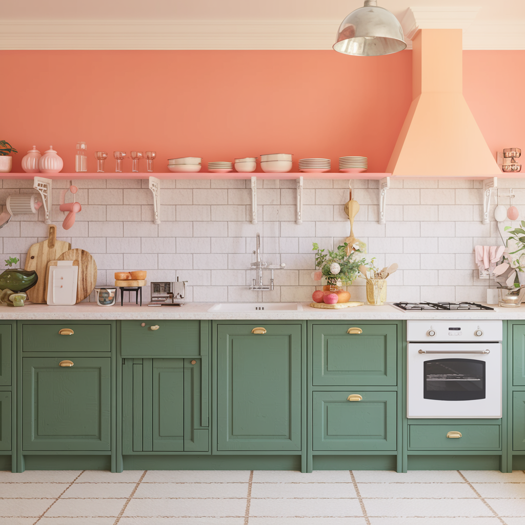
Why They Shouldn’t Work: Forest green’s depth could overshadow peach’s softness, but together they create a serene and harmonious palette.
Use peach sparingly as a supporting color to keep the look balanced
Inspiration: This duo draws inspiration from nature for a fresh, calming aesthetic.
Picture This: A kitchen with forest-green cabinetry and peach-colored hardware. A white countertop balances the look, while potted plants and peach-tinted decor add vibrancy. This palette exudes earthy elegance.
Create the Look:
- Paint cabinets forest green and accessorize with peach handles.
- Use peach accents like curtains or rugs against green walls.
- Combine forest green sofas with peach throws and cushions.
7. Burnt Orange and Soft Gray
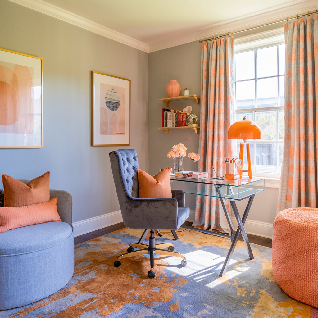
Why They Shouldn’t Work: Burnt orange’s intensity can overpower, while soft gray may appear too muted. However, together they strike a perfect balance between bold and calming tones, making this pairing ideal for contemporary spaces.
Burnt orange evokes energy and excitement, while gray adds neutrality and sophistication, creating a dynamic contrast
Inspiration: This combo is perfect for adding warmth and subtle energy to modern interiors.
Picture This: A cozy home office with soft gray walls and burnt orange accents. A plush gray office chair is complemented by burnt orange throw pillows, while a desk lamp in orange adds a pop of vibrancy. An abstract orange-and-gray rug ties the entire space together.
Create the Look:
- Use burnt orange curtains against soft gray walls for an eye-catching effect.
- Add gray sofas with burnt orange cushions for a cozy living room vibe.
- Pair gray bedding with a burnt orange blanket for a chic, layered bedroom look.
8. Blush Pink and Soft Gray
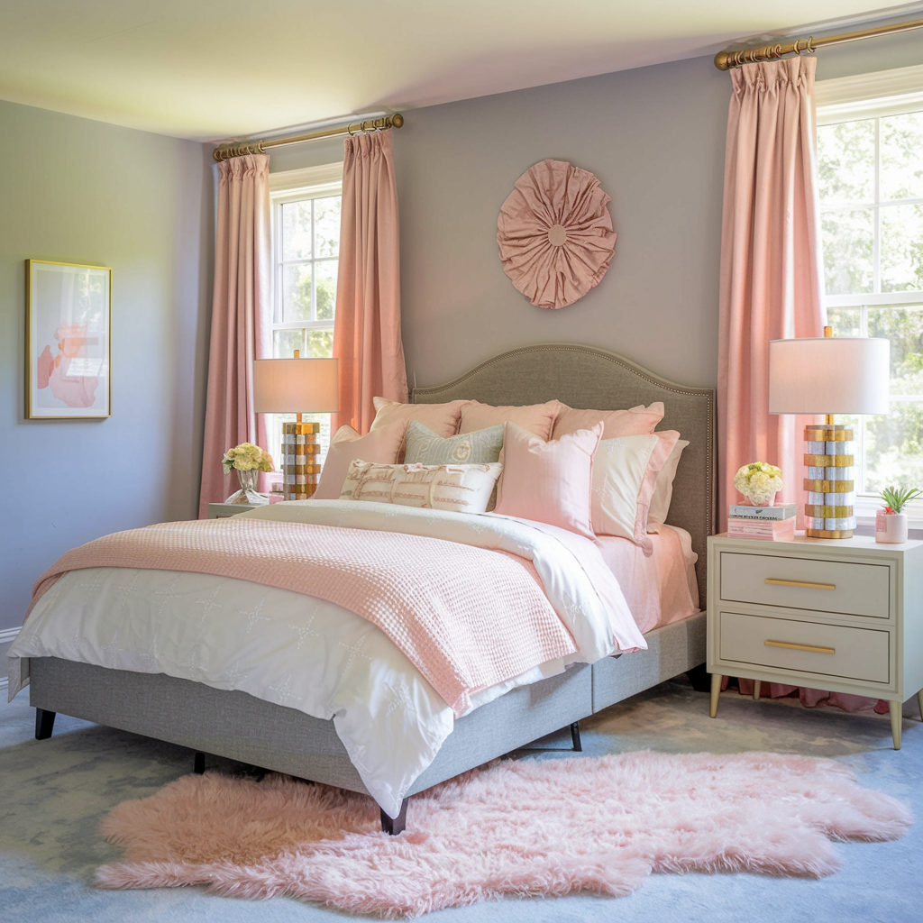
Why They Shouldn’t Work: These soft tones risk blending too much, creating a washed-out look. But when paired thoughtfully, they evoke understated elegance and warmth.
Add metallic accents like gold or silver to enhance the pairing and prevent monotony
Inspiration: Think romantic minimalism with a modern twist.
Picture This: A bedroom with soft gray walls and blush pink curtains. A gray bedframe is adorned with blush pink and white bedding, accented by gold lamps on the nightstands. A fluffy blush rug adds a cozy touch to the space.
Create the Look:
- Pair gray furniture with blush pink throws or cushions for a soft, inviting look.
- Use pink-and-gray patterned rugs to bring depth to neutral floors.
- Hang blush pink artwork on gray walls to tie the palette together.
9. Electric Blue and Neon Yellow
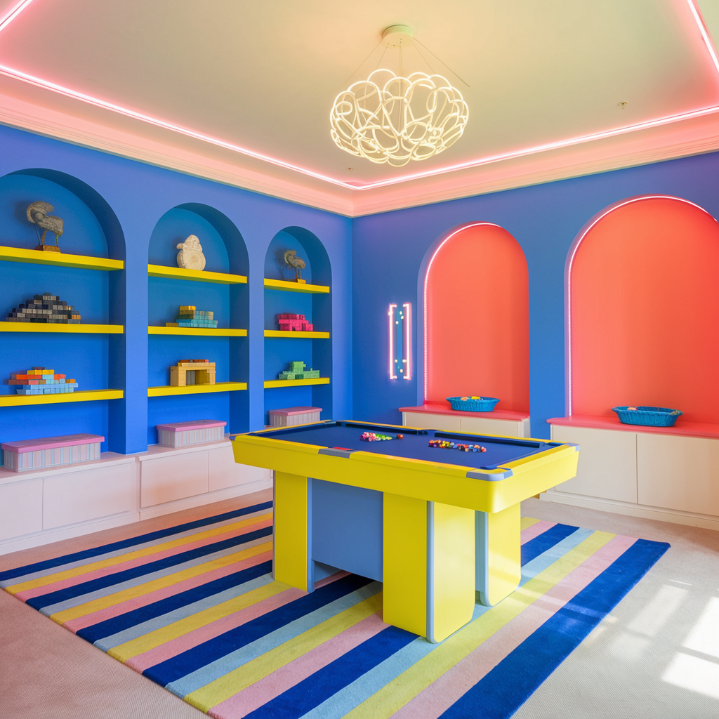
Why They Shouldn’t Work: These two bold, high-energy colors risk clashing, but their vibrancy works beautifully when balanced carefully.
Electric blue symbolizes confidence and focus, while neon yellow inspires creativity—making them perfect for bold, modern spaces
Inspiration: This pair is all about high-impact, youthful energy that creates a fun and dynamic space.
Picture This: A game room with electric blue walls and neon yellow furniture. Bright yellow shelves pop against the blue backdrop, while a striped rug featuring both colors anchors the room. Neon lighting adds an extra layer of vibrancy.
Create the Look:
- Add electric blue chairs with neon yellow cushions for a statement look.
- Incorporate abstract wall art with both hues to brighten neutral walls.
- Use neon yellow desk lamps or vases in an electric blue room for fun accents.
10. Terracotta and Olive Green

Why They Shouldn’t Work: Both earthy tones, terracotta and olive green could feel too muted together. However, their shared warmth creates a natural, grounding harmony.
Incorporate textures like rattan or wood to enhance this palette and add depth
Inspiration: This duo evokes a connection to nature and pairs beautifully with rustic or bohemian aesthetics.
Picture This: A dining room with terracotta walls and olive green upholstered dining chairs. A wooden dining table sits at the center, accented by terracotta and green ceramic tableware. Hanging plants with olive-hued leaves complete the earthy vibe.
Create the Look:
- Pair terracotta planters with lush olive-green plants for natural decor.
- Use olive green sofas with terracotta throw blankets for a cozy living room.
- Paint a terracotta accent wall and accessorize with olive green furniture for an inviting look.
Final Thoughts:
With these color combinations, your home can break away from the ordinary and reflect bold, imaginative design choices. Picture it, plan it, and make it uniquely yours! Which combination will you try first? Let us know!
Some blog articles may contain affiliate links to products or services for which we may receive a commission on transactions. Some of the content on this blog site may be assisted by A.I. generators.
Thank you for visiting our blog!